Tuesday, 29 November 2016
Applied Illustration
My first example is the album cover for "Ship arriving too late to save a drowning witch" by Frank Zappa. First of all I think it's hilarious, and also I find the concept behind the image quite funny and interesting. It was created by Roger Price as a 'Droodle'. 'Droodles' were invented by Price in 1953 and he described them as "a borkley-looking sort of drawing that doesn't make any sense until you know the correct title." A book was published the year of their conception which started a craze around 'Droodles' including college newspaper ads offering prizes for 'Droodles' submitted by students and a televised game show. This album cover is one of Price's original 'Droodles'. Another caption he had for this particular one was 'Mother pyramid feeding her baby'.
I find this an interesting example of applied illustration as Frank Zappa decided to use it after it had already been created, making this more a case of an applied album in a way. Nevertheless I still find it very amusing and it chimes very well with the humour which can be found in Zappa's music.
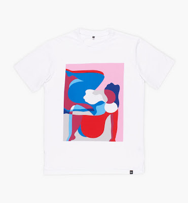
My second example is the clothing company 'By Parra' which features illustrations by the artist Parra. Of course, illustrations on a t shirt don't have necessarily have to be funtional so pretty much anything goes. What I like about Parra's imagery, specifically it's application to clothing, is that you can see that an artist has created it. The images are very well considered in terms of shape, colour and composition and there is a sense that time and effort was put into their conception. I think it speaks of a quality over quantity aesthetic, one which rivals the cheap, mass produced throwaway nature of somewhere like 'Primark', carrying the feeling of art and individuality, or something the wearer can care about, in a nicely subtle way.
The only downside of this is that clothing designed and made in this way is often expensive and thus perpetuates it's own rarity in a way. It's sort of quite exclusive and perhaps comes with a slight air of pretension because of this. It's a difficult balance between the scarcity and high cost of items such as these being exclusionary but also preserving their worth.
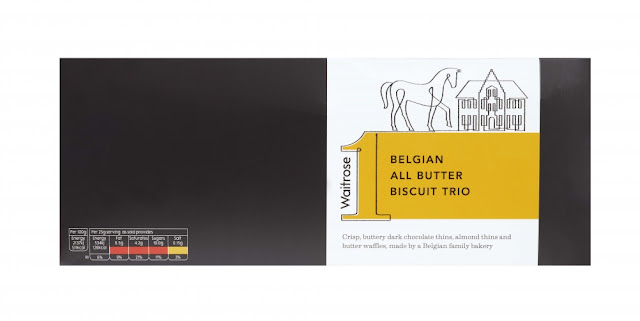
Despite the risk of it being quite naff to include 'Waitrose' packaging in this list, I do actually really like the packaging used on this particular range (waitrose 1), designed by the 'Waitrose' graphic design and packaging team, who incidentally won the Design Business Association 2011 Design Effectiveness Awards, for its work on their last own brand 'Essential Waitrose' range. I think the 'Waitrose 1' packaging design is very elegant and employs fairly sophisticated imagery in a very tasteful way. It fits well with the Waitrose brand identity and I'm sure would appeal to their typical consumers (decidedly middle class). The only thing I don't really like about the design is the big number 1 which I feel lacks a little sophistication compared to the imagery, but a big part of this is that i just don't think it's a very good title for the range so it's not entirely a design issue. I think considering that was the name, it could have been worse.
The French animated film 'Belleville Rendezvous' is probably my favourite animated film, not least because of the quality of the imagery and drawn characters. Indeed, every person in this film, even background characters, is considered in such detail that everything about it becomes incredibly lifelike, expressive and convincing, despite the fact that much of the illustration comes in the form of vaguely disgusting caricature. It was written and directed by Sylvain Chomet and, despite claiming to be chiefly an animator; he also worked as an animator for this film, he is also responsible for the drawings, and it shows. The drawings and realisations of characters and settings sit so well with the way they are animated that the film very much feels like a labour of love, envisioned as one entity from the beginning as opposed to seperate elements which would need to be pulled together.
I saw a book in 'Colours May Vary' which contained 380 pictures of rubber stamps used at train stations across Japan, some no longer in use. I am very keen on these, firstly because I love the look of oriental written language (perhaps due simply to my being unfamiliar with it living in a western society). I find that the lines, marks and shapes which make up the Japanese alphabet (and other oriental languages) to seem much more expressive and gestural than the western alphabets. Maybe this is because I cannot actually read it and so am forced to engage with the forms on a purely aesthetic level, something I have neglected in the western alphabet because i understand what it means immediately and inherently, and am therefore not given a chance to consider it's appearance as separate from what it represents.
These stamps were created as souvenirs, each unique to one station and depicting significant landmarks at it's location, which could be collected by tourists in little books. In my opinion they are very aesthetically pleasing and satisfying and if i was travelling around Japan, I would definitely be motivated to collect them.
Labels:
OUIL402 PPP
Subscribe to:
Post Comments (Atom)


No comments:
Post a Comment